Build your Jupyter dashboard using Solara
Welcome to the first part of a series of tutorials showing you how to create a dashboard in Jupyter and deploy it as a standalone web app. Importantly, you won't need to rewrite your app in a different framework for deployment. We will use a pure Python solution with no JavaScript or CSS required.
Jupyter notebooks are an incredible data analysis tool since they blend code, visualization, and narrative into a single document. However, we do not want to show the code if the insights must be presented to a non-technical audience.
Built on top of ipywidgets, the Solara framework integrates well into the Jupyter notebook, Jupyter lab as well as other Jupyter environments, and as we will see in a later article, can be deployed efficiently using the Solara server. This, by itself, makes Solara a perfect solution for creating dashboards or data apps.
In this tutorial, we will create a simple dashboard using Solara's UI components. The final product will allow an end-user to filter, visualize and explore a dataset on a map.

Pre-requisites
You need to install pandas, matplotlib, folium and solara. Assuming you are using pip, you can execute on your shell:
$ pip install pandas matplotlib folium solara
Or in your notebook
%pip install pandas matplotlib folium solara
The start
We will use a subsample of the San Fanfrisco crime dataset which contains information on types of crimes and where they were committed.
Download the CSV file if you want to run this locally, or let the code below sort it out.
The first thing we do when we read in the data is to print it out to see what the dataset contains.
import pandas as pd
from pathlib import Path
import solara

ROOT = Path(solara.__file__).parent / "website" / "pages" / "docs" / "content" / "04-tutorial"
path = ROOT / Path("SF_crime_sample.csv.gz")
url = "https://github.com/widgetti/solara/raw/master/solara/website/pages/documentation/getting_started/content/04-tutorials/SF_crime_sample.csv.gz"

if path.exists():
    df_crime = pd.read_csv(path)
else:
    df_crime = pd.read_csv(url)

df_crime
The data looks clean, but since we will work with the Category and PdDistrict column data, let us convert those columns to title case.
df_crime["Category"] = df_crime["Category"].str.title()
df_crime["PdDistrict"] = df_crime["PdDistrict"].str.title()
df_crime
Using proper software engineering practices, we write a function that filters a dataframe to contain only the rows that match our chosen districts and categories.
def crime_filter(df, district_values, category_values):
    df_dist = df.loc[df["PdDistrict"].isin(district_values)]
    df_category = df_dist.loc[df_dist["Category"].isin(category_values)]
    return df_category


dff_crime = crime_filter(df_crime, ["Bayview", "Northern"], ["Vandalism", "Assault", "Robbery"])
Now, with our filtered dataset, we create two bar charts. We use regular Pandas and Matplotlib, but Seaborn or Plotly would also be appropriate choices.
import matplotlib.pyplot as plt


def crime_charts(df):
    cat_unique = df["Category"].value_counts()
    cat_unique = cat_unique.reset_index()

    dist_unique = df["PdDistrict"].value_counts()
    dist_unique = dist_unique.reset_index()

    fig, (ax1, ax2) = plt.subplots(1, 2, figsize=(20, 10))

    ax1.bar(cat_unique["Category"], cat_unique["count"])
    ax1.set_title("Amount of Criminal Case Based on Category")
    ax2.bar(dist_unique["PdDistrict"], dist_unique["count"])
    ax2.set_title("Amount of Criminal Case in Selected District")

    display(fig)
    plt.close(fig)


crime_charts(dff_crime)
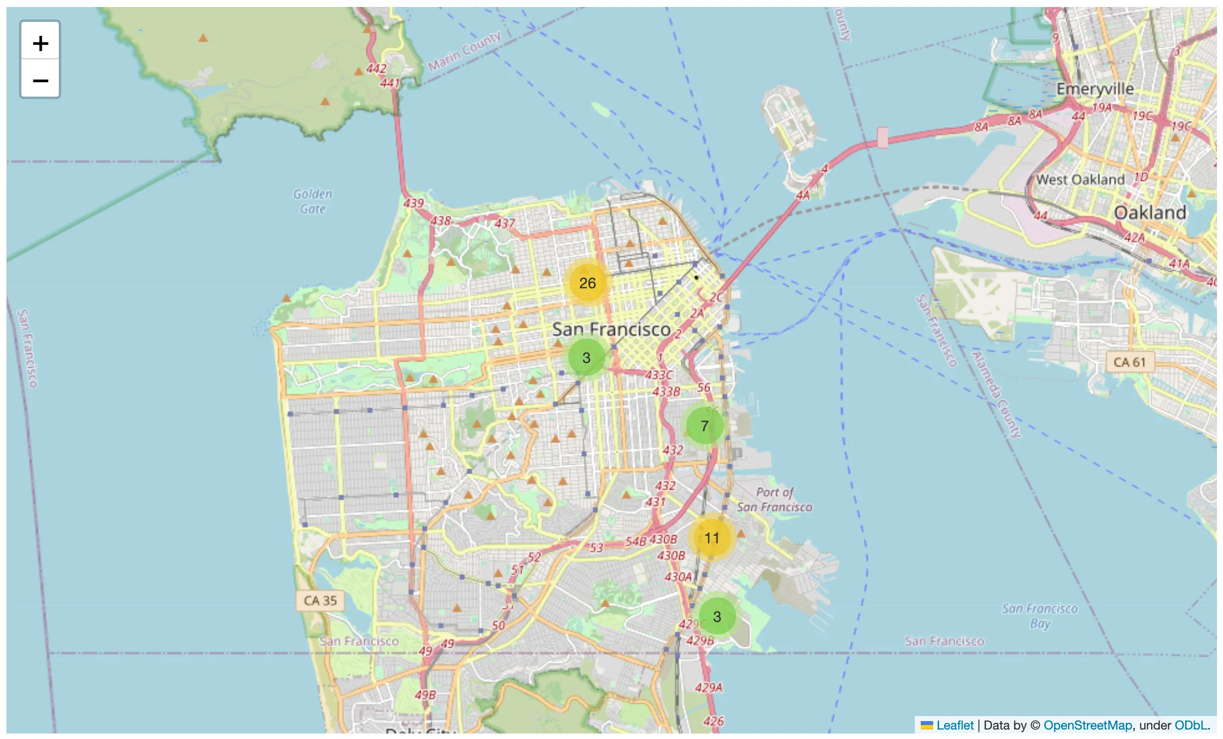
Since we do not need bidirectional communication (e.g., we do not need to receive events or data from our map), we use Folium to display the locations of the committed crimes on a map. If we do need bidirectional communication, we can also decide to use ipyleaflet.
Since we cannot display all the data on the map without crashing your browser, we limit it to a maximum of 50 points.
import folium
import folium.plugins


def crime_map(df):
    latitude = 37.77
    longitude = -122.42

    sanfran_map = folium.Map(location=[latitude, longitude], zoom_start=12)

    incidents = folium.plugins.MarkerCluster().add_to(sanfran_map)

    # loop through the dataframe and add each data point to the mark cluster
    for (
        lat,
        lng,
        label,
    ) in zip(df.Y, df.X, df.Category):
        folium.Marker(
            location=[lat, lng],
            icon=None,
            popup=label,
        ).add_to(incidents)

    # show map
    display(sanfran_map)


crime_map(dff_crime.iloc[0:50, :])

Making our first reactive visualization
The above code works nicely, but if we want to explore different types of crimes, we need to modify and run all cells that determine our output manually. Would it not be much better to have a UI with controls determining the filtering and a view displaying the filtered data interactively?
Let's start by importing the solara package and creating three reactive variables.
import solara

districts = solara.reactive(["Bayview", "Northern"])
categories = solara.reactive(["Vandalism", "Assault", "Robbery"])
limit = solara.reactive(100)
A reactive variable is a container around a value (like an int, string, or list) that allows the UI to listen to changes automatically. Any change to your_reactive_variable.value will be picked up by Solara components that use them so that they can automatically redraw or update themselves.
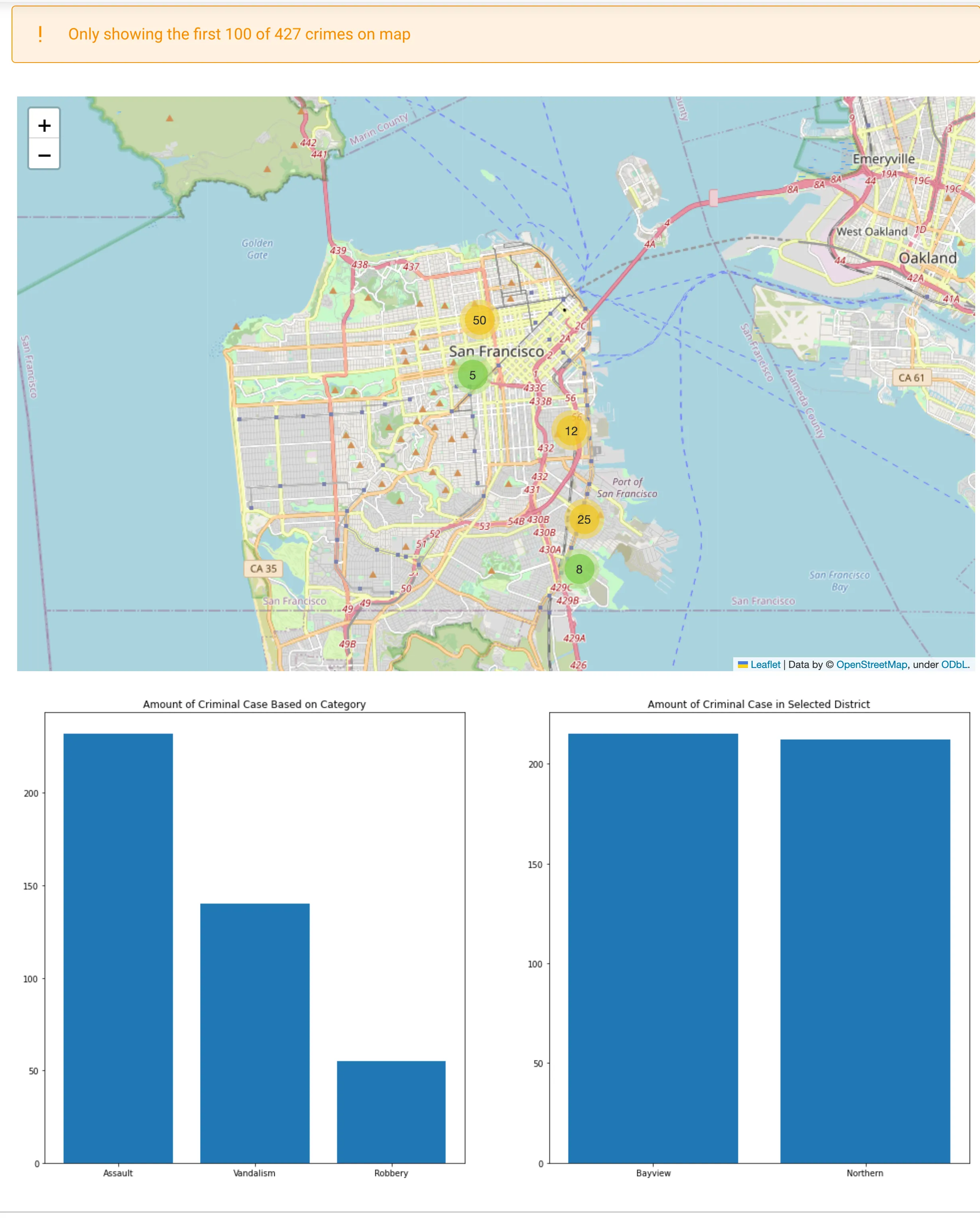
Let us now create our first component (View), which filters the data based on the reactive variables and shows the map and the charts. Solara supports the display mechanism of Jupyter so that we can use our previously defined functions.
@solara.component
def View():
    dff = crime_filter(df_crime, districts.value, categories.value)
    row_count = len(dff)
    if row_count > limit.value:
        solara.Warning(f"Only showing the first {limit.value} of {row_count:,} crimes on map")
    crime_map(dff.iloc[: limit.value])
    if row_count > 0:
        crime_charts(dff)
    else:
        solara.Warning("You filtered out all the data, no charts shown")


View()

Note that some UI parts (like the warning and the charts) are conditional. Solara will automatically find out what to add, remove, or update without you having to do this manually. Solara is declarative (similar to ReactJS) but also reactive. If we change the reactive variables, Solara will see those changes and notify the component instances that use its value.
If we run the next lines of code in our notebook, our View will automatically update.
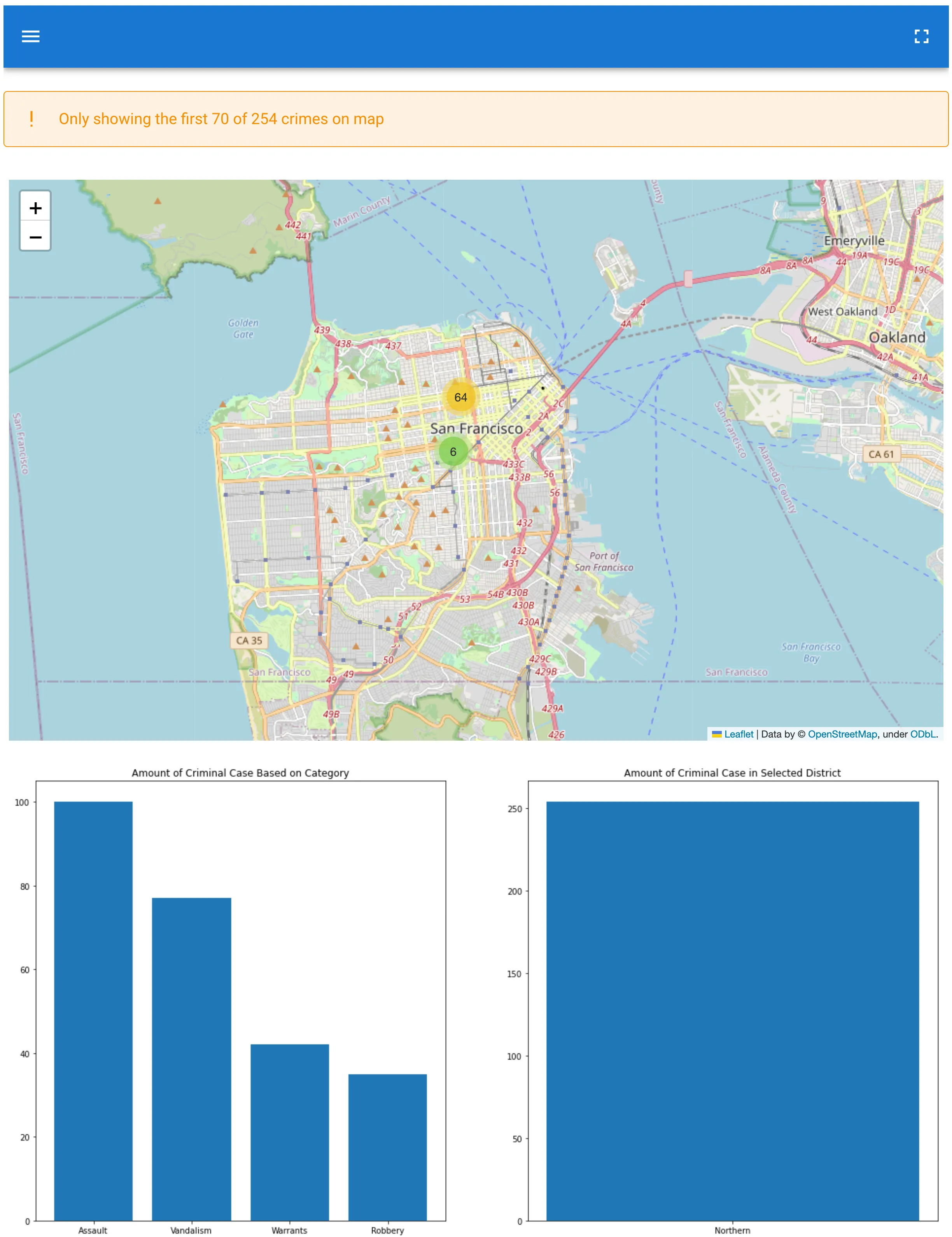
limit.value = 70
districts.value = ["Soutern", "Northern"]
We can now explore our data much faster since we don't need to re-run the cells that depend on it.
Solara's reactive and declarative nature makes it scalable to much larger applications than regular ipywidgets, where keeping the UI in sync and adding, removing, and updating widgets is a manual and bug-prone process.
Adding controls
We created a declarative and reactive mini app in our notebook, but we still need to manually modify the values by executing a code cell in our Notebook. Now, let us create a UI to control it. All Solara input components support reactive variables. This means that controlling a reactive variable using a UI element is often a one-liner.
solara.SelectMultiple("District", all_values=[str(k) for k in df_crime["PdDistrict"].unique().tolist()], values=districts)

Whow, that was simple! We can now easily change the filter and see the results update. Lets do this for all our reactive variables, and put them into a single component.
@solara.component
def Controls():
    solara.SelectMultiple("District", all_values=[str(k) for k in df_crime["PdDistrict"].unique().tolist()], values=districts)
    solara.SelectMultiple("Category", all_values=[str(k) for k in df_crime["Category"].unique().tolist()], values=categories)
    solara.Text("Maximum number of rows to show on map")
    solara.SliderInt("", value=limit, min=1, max=1000)


Controls()

Note that the reactive variables are bi-directional, meaning that if you change it in the UI elements, it gets reflected on the Python code!
# Note that we can read AND write reactive variables
categories.value = [*categories.value, "Warrants"]
The final dashboard
We now have two parts of our UI in separate cells. This can be an amazing experience when developing in a notebook, as it flows naturally in the data exploration process while writing your notebook.
However, your end user will probably want something more coherent. The components we created are perfectly reusable, so we put them together in a single UI.
@solara.component
def Page():
    with solara.Sidebar():
        Controls()
    View()


Page()

Conclusions
Using Solara, you created an interactive dashboard within a Jupyter notebook. Your Solara components are declarative, and when using reactive variables also reactive. Whether you change a reactive variables via code or the UI elements, your visualizations and map update automatically.
Your dashboard prototype now runs in your Jupyter notebook environment, but we still have a few steps to we want to take. In our next tutorial, we will focus on deploying our notebook, without making any code changes. In our third tutorial we will expand our dashboard with a few more components and focus on creating a more advanced layout.
Explore this app live at solara.dev.
Don’t miss the next tutorial and stay updated with the latest techniques and insights by subscribing to our newsletter.
